|
The project for the company Lea is one of the first most comprehensive ones made by our studio. We started by creating an united philosophy needed to prepare the guidelines for the company's strategy and later to apply to the products themselves.
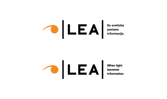
The main focus of the company and its products is giving visual information. This is why the brand logo incorporates the eye (signifying "visual") and the grammatical comma (signifying the "verbal"). The digital pixel symbolizes the company's core technology, needed to produce the LED information displays.
The innovativeness is incorporated in the logo by making it asymmetrical and by giving it an unique shape, which symbolizes a spiral, visual motion to infinity and beyond. By adding these elements together in various configurations we achieved a great sense of order, systematics and modularity, all strong factors of the company's products. The Lea logo reflects the company's main focus; to channel information in a well organized way.
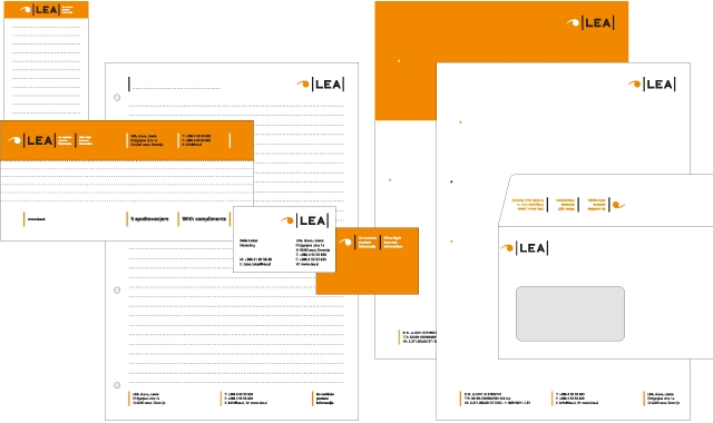
The identity's core color chosen is bright orange, that carries the notions of light and great visual recognition, as well as visibility in the most extreme conditions. The vertical lines signify growth and evolution and are deliberately highlighted throughout the visual identity. This element is also present in the company's products, which all have vertical dividers between the LED panels. All this further builds the brand.
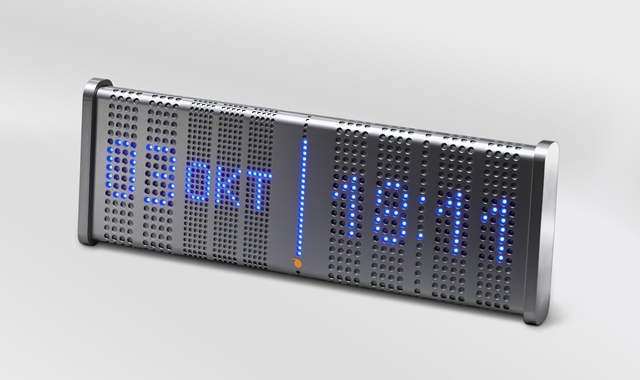
The design of the products themselves is first and foremost systematic and modular, which enables the manufacturer to create many different products form one well thought out system.
|
|
Business case:
A unison of an identity and products contribute to a better output
Identity:
Barbara Šušteršič, Jure Miklavc
Product design:
Jure Miklavc, David Cugelj
Client:
Lea d.o.o.
Year:
2006
|
|